
Friday 31 January 2014

Saturday 18 January 2014
Research Into Graphic Designers
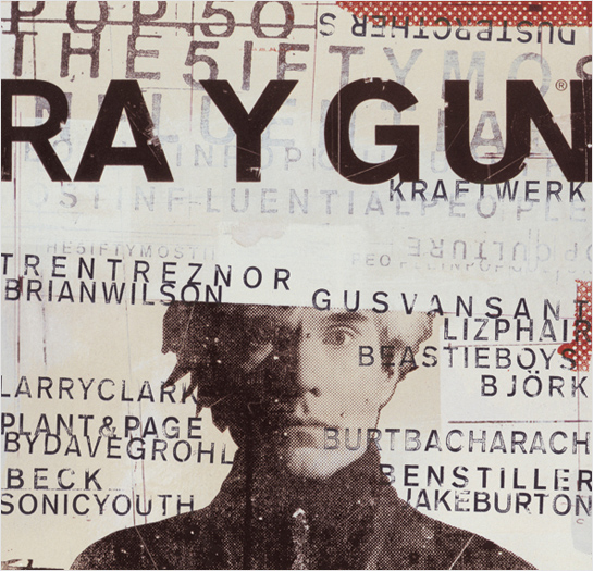 David Carson is an American graphic designer best known for his design for the magazine 'Ray Gun'. David enjoyed Grunge typography a lot and included this in almost all of the work he produced. His style was very unique because it appeared as an almost unreadable mess that just looked right; he very commonly produces images that have parts replaced with grunge typography adding to his creative talents.
Carson left Ray Gun to make his own studio, and in the following years he did work for many companies including, but not limited to, Ray ban, Nike and Pepsi Cola. Not only does Carson produce these designs, he regularly holds lectures and workshops in America and Europe to help inspire those who want to become graphic designers just like him.
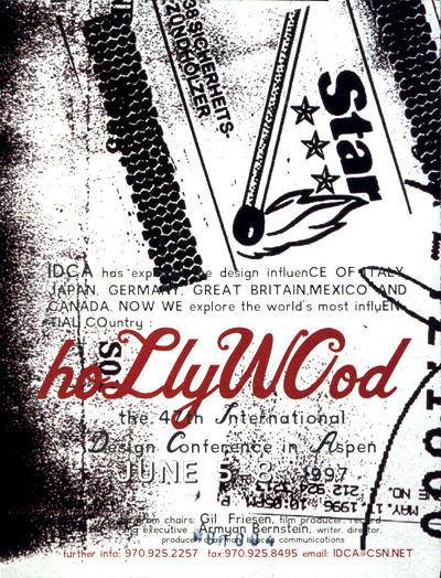
Below are some more examples of his work; showing off some of his creative talents, and giving a better explanation into his grunge text format:

Style of Magazine

For a contents, my style would revolve around something similar to that of Mojo. Mojo focuses it's contents on a single image with a small box containing
Audience Profile
From the research I've made, I've decided that my target market would be primarily male aged from 16-30, as I think that this is a suitable and achievable target audience. The stereotypes of Rock and Pop-Punk come into play here. I have composed an Audience Profile of an example of what I would assume to be my Audience.
 Name: Tyler Black
Age: 17
Music Genres: Typer prefers to listen to Punk-Rock and Rock music on a regular basis.
Biography: Undergoing his first year of A-Levels, Tyler likes to spend time relaxing browsing Tumblr and listening to his favourite bands 'Paramore and My Chemical Romance'. Although his personal preference does not always focus around Rock music, he would still say that this would be his preferred genre.
Analysing of Institutions
Upon looking into different institutions that would potentially publish a magazine I create, one name that constantly came up in many different articles was 'Bauer' renown for the publication of Q, Mojo and Kerrang. Bauer operates in 15 countries worldwide and was founded in 1875. The following is extracted from the Bauer website, and speaks more about what they are as a company.
From reading this it is very apparent that this institution would be a perfect match for my magazine, as my genre is very similar to that of what is already being produced by them.
Bauer Media is a division of the Bauer Media Group, Europe’s largest privately owned publishing Group. The Group is a worldwide media empire offering over 300 magazines in 15 countries, as well as online, TV and radio stations.
Bauer Media joined the Bauer Media Group in January 2008 following acquisition of Emap plc’s consumer and specialist magazines, radio, TV, online and digital businesses. Collectively, the Group employs some 6,400 people.
Bauer Media is a multi-platform UK-based media Group consisting of many companies collected around two main divisions – Magazines and Radio - widely recognised and rewarded as being industry innovators.
Our business is built on influential media brands with millions of personal relationships with engaged readers and listeners. Our strategy is to connect audiences with excellent content through our broad multi-touch point brand platforms, wherever and whenever and however they want. Our wide portfolio of influential brands gives us advantages over pure play magazine or radio competitors.
Our magazine heritage stretches back to 1953 with the launch of Angling Times and the acquisition in 1956 of Motor Cycle News, both still iconic brands within our portfolio.
The seeds of the company’s radio business were planted in 1990 with the acquisition of London dance station Kiss FM (now called Kiss 100), followed by the acquisition of Liverpool's Radio City and later by TWC and the Metro Group. Then came the acquisition of Melody FM which was transformed into the market-leading Magic 105.4.
In 1994, the company bought a small magazine called For Him Magazine which is now the core of the best-selling international multi-platform brand FHM.
In 1996, we acquired digital music TV channel The Box, as a route into the small screen business, which has grown into Box Television, a seven channel joint venture TV business with Channel 4.
Continuing its history of magazine launches, Closer was launched in 2002 and Britain’s first weekly glossy, GRAZIA, was launched in 2005.
Today, Bauer Media spans over 80 influential brand names covering a diverse range of interests including heat – the must have weekly celebrity title, Parkers, MATCH!, CAR and Yours.
From reading this it is very apparent that this institution would be a perfect match for my magazine, as my genre is very similar to that of what is already being produced by them.
Audience Research
Though Hardcore is a new addition to UK Tribes (it’s only recently regained sufficient momentum to genuinely warrant inclusion), this Tribe has its roots in the punk rock scene, originating in LA in the late 1970s. California’s Black Flag are often referred to as the godfathers of Hardcore.
The ethos of the Tribe resolves around two core values – self-expression and individuality. Hardcore Kids are passionate about the Hardcore sound, a screaming genre of punk with severe tempo changes, double bass in the drums, and dirty chords from the guitarists (heavily distorted, tapping into any feedback and harmonic noises available!) Tribe members will actively support independent record shops and local, homegrown bands.
Image is key to the Tribe, and the look is not so dissimilar to the Hipsters – think turned up skinny jeans, tight fitting band tees, plaid shirts and Vans. Tribe members will often have tattoos, showing their creative side through full-scale sleeves or individual flash pieces. As Skin Deep columnist Paul Sweeney says, “Nothing shows commitment to self expression like custom tattoos and body modification.”
- From uktribes.com
I looked at the different Tribes to try and find a group that would become my Target Audience. Instantly I found 'Hardcore' that have the roots of Punk Rock, and show self expression through custom tattoos and body modification, not unlike the research into Style of the Genre.
I am going to be asking my peers some questions in order to formulate a structure to help decide the format of my magazine, and make sure that what I produce is in fact what the consumer wants (The consumer being people of the 'Hardcore Tribe')
1.) What Artist has inspired you the most?
2.) Do you fit the stereotype of Rock Fashion?
3.) Where do you go to buy your clothes/ stylish items?
4.) Are you a regular listening of the Radio?
5.) Would you say you can pinpoint just one genre you enjoy?
6.) Of the Genre(s) you enjoy, why is it you enjoy them?
7.) Does your lifestyle reflect your music taste?
8.) Have you experimented with alternative genres?
9.) How interested are you in the 'Behind-The-Scenes' of bands you enjoy?
10.) Are you lyrics of the songs you listen to important to you as a person?
Friday 17 January 2014
Research Into Fashion/ Styling of Genre

The majority of people who indeed like this Genre of music can't really be labelled down to a single clothing style, so we are going to be talking about the Rock/ Pop-Punk stereotype. The image on the left is a good example of what we would pin point as a 'rock loving' individual; he is wearing chains and has a dark/ grunge shirt containing a skull.
The man has tattoos on his right arm, which is a very common stereotype with the Rock genre; we associate the rebellious attitude that youngsters have with rebellious music such as Rock itself; by seeing a person that has chains and tattoos we automatically assume that they are into that type of music, without questioning it any further.
Modern music is more technological than that of previous music such as Rock; for this reason the popularity is becoming rarer to identify. The Style of Rock Music is very instrumental, in a way that every instrument is physically recorded as well as the vocals, as apposed to electronic music where as most instruments are synthesised.
Depictions of Rock vary amongst different media platforms; a magazine that revolves around the genre would probably judge the music style a lot differently than a magazine that reviews all types of music. We usually reference Rock artists as very hardcore and over excessive, a great example of this would be KISS, who obviously are entirely different to many other related bands; a point to make is that bands like KISS are still playing music even after the evolution of music we have currently.
Deciding Magazine Title
Using my Magazine Name research I have been able to think about what makes a successful name;
Language Register
The style of writing when it comes to Rock/ Pop-Punk Magazines is very casual, as the article writers want to try and connect to the audience on a personal level. Since I want my Magazine to come across as very friendly and socially sound, I will try to make sure that my style of writing is very personal and inclusive.
Magazine Name Research
Magazines are given names that represents what they are about, or what they include; I did some research into the different names that some Magazines have and why they are given such name.


 Following the success of Q, the magazine 'Mojo' was created to help bring more attention to Classic Rock Music. Every article of Mojo includes an exclusive CD.
Kerrang is a Rock Music magazine produced in the UK. The name Kerrang comes across as odd because it does not mean anything; the origin of the name comes from the sound that is made by playing a Power Chord presented through an onomatopoeia.
Q is a Pop Music magazine produced in the UK. Q has an interesting name because of how short and unexplained it appears; Q's original name was 'Cue', as in to cue on the next act at a concert, but over time they changed the name to simply the letter Q.
Mood Boards
I created a mood board to show the inspirations I had to make all the choices I made for my Magazine. It also includes several images that represent the Target Audience that was being aimed for, as well as linking to the Genre.
Research Into Photographers
 Michael Hughes created a series of images after accidentally discovering a method of replacing famous landmarks with cheap souvenirs in photographs; upon discovering this he scoured the globe for hundreds of monuments to take perspective photographs. Although this is not entirely relevant to my magazine, I can use this technique to help me; the concept of replacing part of a picture with another object to make it appear as if the object belongs in the space it is contained is not a particularly over-complicated process, and it could be easily implemented by simply making an artists face replaced with a picture of their face to represent a different personality, or to portray a different side to that person. The format has been used in previous works of literature, such as magazines, previously, and the reception has been mostly positive. The reason I really like this idea, is just because of the endless possibilities that Michael produced; there were an infinite amount of landmarks and famous places that he could visit to replace monuments, and even vehicles in some cases. The same applies for my magazine photo, there is a near infinite amount of possiblities that I could work with in order to implement this function if I chose to.
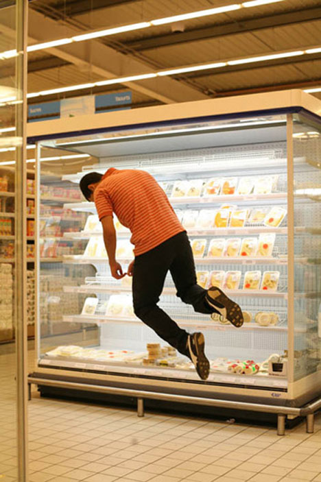
Denis Darzacq is a Paris Photographer who enjoys depicting people in Mid Fall, or Mid Jump to give the illusion that they are suspended in flight. Chinese Photographer Li Wei also enjoys the same concept, but instead involves himself in his images; placing himself into life threatening situations in order to get the perfect shot. The image on the left is of Denis, we can see a character who appears to be floating, with the shutter used to reduce blur and give the impression he is in a fixed position. The photo on the right is of Li; instantly we can see that the situation is changed, with a very scarily life threatening scene presented. Although Li's photography appears very dangerous, it is not as dangerous as it seems; Li is quoted on saying that in some photos, such as the one below, certain safety procedures, such as scaffolding, are edited out whether that be physically removing them in post-production editing or altering the camera's position to remove a sense of depth. Although the photos that Li takes are not as dangerous as they seem, there are still some health risks that come about with them; he is also quoted on saying that the risks depicted are not dangerous, it's attempting to take the photo that is dangerous, as it
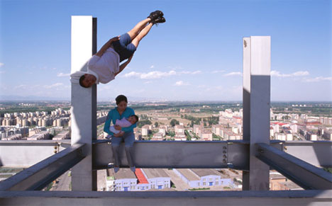 is literally required for him to be in correct position that he wants to achieve. In the photo we can see here, he is frozen almost upside down at a scarily large height; this photo would have required for him to be in that position, even if it was for just a second, meaning he would have propel himself in order to achieve the correct frame; although this appears to be of a extreme height, in actual fact it is not at all that high, with a floor underneath the structure that the lady in the photograph is sitting on, and presumably there would be a crash mat or some sort of way to catch Li as he falls down. This concept of photography is very interesting because it is very original; although mentioned before, this is not the first appearance of this concept, it really is one of the best representations that I could find. The concept of the time frozen still photography is perfect, because with photographs we forget that everything is put to a halt, and within the frame we have movement, it's not very often we have an image where everything has completely stopped moving. I could implement this into my Magazine very easily by having the person/ people I am photographing jump off the ground before taking the photo, although chances are my photo will be from the waist up, meaning unfortunately i could not include this within my plans. I would love to find a way to get this into my project, as it would open up a range of possibilities that could be achieved through the photography, allowing for many original images.
Examples of Other Text
By researching into my favourite Magazines, I have been able to pull a few that I feel I could benefit from taking inspiration. The Magazines listed are from the past 12 months.
Kerrang mainly features very cluttered and compact cover pages, which I love. There is no space wasted on these pages, and for that reason I think I could take that inspiration away; I should try not to waste space on my final design and produce a well positioned and well filled final magazine.
This one in particular is a favourite of mine because of the text positioning; the sell at the bottom of the page is rotated slightly to the left giving an uneven and clean look that fits in well with the large 'Issue 1500' in the centre cover line. The images on the page of the three artists blends perfectly with the background, with little to no noise around the rendered images and a slight lighting glow around the edges allowing them to become contrasted with the background image.

This one in particular is a favourite of mine because of the text positioning; the sell at the bottom of the page is rotated slightly to the left giving an uneven and clean look that fits in well with the large 'Issue 1500' in the centre cover line. The images on the page of the three artists blends perfectly with the background, with little to no noise around the rendered images and a slight lighting glow around the edges allowing them to become contrasted with the background image.
Although this is not of the same Genre I am going to be doing, it has some nice techniques that i would like to take apart. The logo for this magazine has the 'The' rotated onto it's side, allowing for a clean implementation of the name of the magazine; a downside of this is that if you look closely you will notice that the Magazine name is not centred.
The colour scheme for this cover is very simple, with Red's and Whites, Red being background colour, since there are people dressed in white in the foreground contrasting. The sell at the bottom left follows the White and Red theme with Red separating the two white sells preventing a list of white text that would not look physically pleasing.
This is an extremely simple cover in comparison to the previous two, with a while and pink colour scheme. White acts as the base colour, with the background being entirely white, only contrasted with the shadows of the two models photographed. There is a sickly looking gradient fading from transparancy to white at the top of the page linking the Magazine name into the background; this might seem like a good idea, but all in all I would say it looks unprofessional.
The fonts used are all of the same Height and no Ascending or Descending letters; this allows a very clean and smooth looking block of text, which would suit my magazine perfectly.
Colour Palette Analysis
#020202 | #746D58 | #35E1F8 | #726B59 | #070707
This Palette appears very restrictive when it comes to colours as it looks as if there are just three, with two being repeating twice. The two that appear repeated are not actually the same colour and have slightly altered Hex codes; this is because by using two colours that are similar but not identical you can create a very good sense of density. The centre colours, which appears as a Light Blue-ish appearance is much brighter than the rest of the colours that are listed; for this reason it allows it to stand out a lot more than you would think, especially since it contrasts so well with the Grey. When this particular Light Blue is placed on top of a Grey Surface, it gives a sense of contrast that causes them to blend very well, whilst if we place the Light Blue onto the Black surface we are given a very large sense of separation because of how different the two colours are.
This colours would suit an Electronic type genre because of the use of Blues and Greys created a very techno type style. For my Genre of magazine, I would probably not be able to fit this in, as the use of Light Blue is very irregular for a Pop-Punk Magazine.
#F1CBA7 | #B946A1 | #72489A | #49339F | #B0B2D
This Palette mainly focuses of different shades of blue as apparent by the Hex Codes; we start off with a very light 'Sandstone' colour which contrasts perfectly with the second colour. Against the rest of the shades of Blue, the Sandstone does work very well, although not perfectly. The use of Blue obviously gives the theme of Sky/ Water/ Calm to whatever project the palette is used on; for a magazine it would be very dependant on the background image used to decide whether or not this would be a palette that would be suitable because you would not want a calm colour scheme for a heavy metal magazine.
As listed above, this would suit a genre with relaxed music, and as such I do not think this would suit my Magazine very well; it might work depending on the background image and the theme of the general issue, but in the long run I do not see this as a useable scheme for my Magazine genre.
#FFFFFF | #FFC6C0 | #DE8678 | #864C41 | #562119
Although this pattern is very positive with the use of Pinks/ Reds, I do honestly think this could work for a range of different Magazines. An obvious use of this would of course be a 'Cute', maybe Girlish magazine, due to the friendly shades of red, but used in the right way this could be used to represent a number of different genres. Red is an interesting colour, because for one It represents Love and Happiness, but then on the other hand it also represents Blood and Gore. The use of White blends very nice with this colour scheme, because white go with just about anything to give it a nice addition. The title of this scheme is 'The Divination of Blood', which brings to me to think that the uploader intended the colours listed to be seen as 'Blood' as apposed to Love and Hearts.
This might work for my Genre because of the addition of White; the Dark Red would be used as the base colour, and the alternate shades of Red would be there to compliment it; the white would be the focus of the text as it would blend perfectly with the darkest colours, although the lighter shade of Red does not contrast well with the white.
#F04A56 | #4A87F0 | #42D678 | #B63FCB | # F5DFD1
For a Genre of Pop-Punk, this might work, especially because of the Blue's. It would be assumed that this Colour Palette would suit a Kid's Music Magazine, which at first glance might seem like a strange choice, but depending on how you use the colours, the concept can change.
#FBECFF | #C193D3 | #863F81 | #4B0A34 | #2B0015
Darker colours work a lot better than lighter colours for the Genre I am picking. There is again a focus on blue throughout this scheme, although it is not as bold as one of the previous colour palettes. The use of Dark Colours would allow the white to stand out a lot more clearly, and such the light blue will also contrast well. All of the colours blend together well; as you can see on the strip they all pass over to one enough very cleanly.
Rock would suit this style well, because it gives a 'stormy' effect that is very similar to some of the magazines I analysed. The Dark 'Black' colour would act as the main focus, with the other colours acting as compliments, especially the White, which would the basis of the majority of Text.
#E4FA7A | #FFC259 | #42C3C3 | #B6054C | #0C0550
The main theme of this Colour Scheme is a Desert style, meaning that the Genre that would sort this style most ideally would be an Indie magazine. The darker colours are there to blend with the lighter colours, although the shades chosen are chosen so that the entire thing Contrasts together very strangely; The sand colours stand out on the Dark Blue, although not entirely, it is very strange and does not look perfect, but for some reason works fine.
My Genre of Pop-Punk and Rock might be able to incorporate this Palette, but in the long run I would say that it would not. The colours used are ideally intended for Indie-Rock magazines because of how different the scheme is; the sand colour would act as the background with the darker colours being positioned on top (The opposite would not work as well).
#F7CBCB | #FAACAC | #660202 | #890505 | #D27070
The Palette is very focused on Pinks and Reds using shades of Pinks titled 'Pinkiness' and shades of red titled 'Blood Bath'. As made apparent, there is quite a range of themes included within this Scheme, but I would not think that one of them would include Rock. The darker Reds might fit in with the Harder aspect, but with the addition of Pinks, especially how bright this appear, they would not contrast well enough to hide the fact that the entire page would be based around the colour Pink.
In terms of Genre, I would again say that this Pink design would fit a Pop magazine, especially one targeted at girls. There are many Japanese 'Cosplay' magazines that use an almost identical colour scheme which helps back up the point I make about the separation of Genres being difficult.
#FFFECD | #FFF463 | #BBD7A7 | #DF6558 | #DF6558
Containing a range of colours, this scheme is very indifferent; as you can see, we range from a Bright White, so a Medium Rose, this makes it very hard to pinpoint a Genre and thus choose whether or not this would be suitable for a Rock/Pop-Punk magazine. It could be said that the colours represent Life and Death, with White being the start and Red/ Blood being the last. The White would act as the main colour with the other colours contrasting well; the Greyish-Green colour would not entire blend with the white, so it would be assumed that this would be used with one of the darker colours to make it stand out.
I would argue that this list of colours represents a positive mood, and as such this would mean that the Genre of magazine would be one that includes positive colours; Pop Culture magazines would most likely be the type of Magazine that would favour this scheme, not Rock.
#F19E9E | #F45959 | #CA1A1A | #770606 | #080000
For a Rock/ Pop-Punk magazine, this colour scheme would work very well. The inclusion of black amongst different shades of Red would allow for a very contrasting and well blended pattern. The main colour to focus on here would be the Black, with the Red's providing important information, and the occasional pink for Shaded effect. Because of the Pink, this set of Colours could represent either a heavy Rock magazine with a dark background and bright colours or a happy Pink background with Dark colours for a more positive Pop-Culture magazine.
The Genre of my work would suit this perfectly, so I would say that this would contrast very well. As said before, this set of colours can work both ways, which is different from the others, which all focus on one Genre.
#00C5F3 | #B4EDFA | #EEA6EE | #971F65 | #3A0041
This selection of Blues cause a very confusing standpoint, as again it entirely depends on what image is used on the cover. Unlike the previously mentioned Blue based colour scheme, this uses a different range that allows for the adjustment to a larger amount of Genres.
I do not think this would work for a Rock Magazine, again I would say this would suit an electronic magazine since Blue is more of a computer-style colour.
Fonts Analysis
Animal Silence: This font is very different as the Uppercase letters of words have a strange slanted efffect; this makes it a lot more interesting. Although the rest of the letters are lowercase, they appear as if they are Uppercase as to fit in with the theme; there is a fixed height of the Font, which means that this would be very useful for a magazine in situations such as a header on a page (An interview for example). By not using any uppercase letters, this font can appear completely different, as the only aspect that really singles it out is that slanted Capital Letter; by not using uppercase you could very easily use this font for the cover, for example as a small sell. There are no Ascenders in this font as everything is on the same line.
My Genre focuses on Pop-Punk/ Rock, and as such this font would fit into the theme quite well, with and without the Uppercase slanted letters. The slanted letters act as much of a design addition, where as I could include a small word resting on the slant. An example of this would be the contents where I could include the word 'The' on the slant and have the text say 'Contents'. Another example, although one that might not work as well, would be to have the word 'Exclusive' on the slants with the text reading 'Interview with...', this technique would work because of how every uppercase letter has the same slant degree.

Bebas Neue is by far my favourite font just because of how it looks. There is a fixed height, as well as a fixed width for every letter which means that the words you type have a very neat appearance. When converted to white and given a shadow, this font sticks out very well on a page of content; it is very easy as well to add a gradient to each letter to give it a 3D effect, although this would probably not fit in with my magazine very well. Every letter in this font is uppercase regardless of how you type; although at this size it appears very clean, when set to larger fonts it does not look as good because of how thin it is; this will not impact me on my choice to use this font, as it is not the right type of font to use for a header of my genre.
When this font is used in a small size it really shines because of how tall it is; it terms of genre, I would not say that this font could actually be held down to any, and for that reason I do think it could be incorporated into my magazine. In the long run this would act really well for a sell on the cover, because of how small it can become while still being readable.

Break it: This font would work perfectly for the name of a magazine; when placing this font rather large at the top of the page, it fits in perfectly as a Header. There is no fixed height, so there appears to be a curve, giving it a creative addition. A Rock magazine would match this very well because of how it appears to be shattering; the shatter is dynamic that it will stretch across the word you type indefinitely. You could say that the shatter would represent the heavy nature of the music style I mentioned, although this might be overanalysing.
I can see where this font would match with my genre, but I can also see how it would not; I fear that if I made this a banner it would come across as too 'out there', and over-excessive because of the crack throughout the test, and as far as I am aware there is no alternate version.

Butch & Sundance: As a very stylized font, this works pretty well. The More-than and Less-than signs act as images that help separate this as a header. The & symbol changes into a small image that reads the word 'and'. I think if I was to use this font, it would be to just take away the dynamic characters, such as the & symbol, because I feel that if I was to mix this with a different font it would work very well. I see the & symbol as a very useful tool, as I can see how it would fit into a contents page; the page would list all of the different articles throughout the magazine, and then have a giant '&', then include reference to the cover story. The height varies depending on letters, with the majority of letters being defenders; I feel as if this would not work for a magazine because they would create unused space below the header, although I might be able to just use Ascending letters, such as those that are uppercase because they appear on the same line.
For Pop-Punk/ Rock, this does not fit completely; I would say that this would be more for a US Country magazine due to the descending letters and overall style.
Karmatic Arcade: Fonts like this are very different, because they are technically an outline. If you were to add this font into an editing program such as Photoshop, the inside 'white' area would appear transparent due to how the font is encoded; this is not very useful as it means I would have to manually add a white inside through editing the text, or creating a layer underneath that is cut to the correct size, which could possibly reduce some quality. There is a fixed Height with the font, and it technically acts as if it is one image by how it blends together into a line.
This font is an 8-Bit style; 8-Bit is a very common format when it comes to 'Video Game' related designs, I think that this font would fit a Video Game themed magazine a lot more closely for this reason. I can see this fitting in with the sell of a Magazine Cover, but when it comes down to it there is really not much appeal for this kind of font on a Pop-Punk magazine.

Impregnable: As a handwritten, and near impossible to read font, I can not see this fitting in at all to my magazine. The only way I can see this fitting into a magazine, would be for a brief word on top of another word, such as a very large 'INTERVIEW' and a small 'Exclusive' written in this font in the top right corner. As it is handwritten, it includes a lot of flicks to give the impression of written text; because of how the font acts joined up, it means that there has to be a dynamic that makes sure that every letter connects to the next letter.
A Genre that would most likely include this type of font would be some sort of classical magazine; it could be said that this would work for other genres if you were to convert the text to white and give it a very bold shadow, but I would say that in the long run it does not appear as a very suitable font for the majority of different magazines.

Impacted is a play on the default Windows font 'Impact', acting as a much more playful and curved counterpart. The letters are not on the same line, giving a sense of movement; each letter has a fixed positioning so that regardless of what order you put them in, each letter will always be raised in the exact same way. Using this font can work well if the project you are developing has a very 'messy' design; for the Genre and design I want it could work, although I fear that since every other font that I think would also suit are based on a line, and this is not, it would not fit.
A Genre for this would be Alternative Indie because of how it is a changed version of an already existing font. My Genre is Pop-Punk, so I could not see this fitting in in any respect.

Lazy Sans: This is a very unique font because of how it looks; each letter appears as if it is shaking. The face that comes with the font is linked to the Copyright symbol, although I will probably not use this because it does not fit with my magazine. Different letters look better together than others; this is due to how the effects of shakiness are presented; for this reason, it will be dependent on what I want to do in order to decide whether or not this font would be good font to use. Although there is a shaky outline to the text, it is very bold where the actual text is, and there are other font options under this category that include the same font without the effect.
This font would be more useful for a Dance magazine as it shows movement; this would not fit my genre, and as such I could not use it.
Subscribe to:
Posts (Atom)