My Prelim task focused on a school magazine; I used a stock photo background and a dark image that was not taken in the best of conditions. I used an outer glow on the image to make the model seem as if he was actually in the background and not just added on. I already had some knowledge of the programs I was going to use, although I did gain some knowledge throughout the production. I that my biggest downfall was my positioning; I struggled deciding where I would position each of the components of my design work, although this did improve throughout the production of my magazine.
My confidence has improved a lot when it comes to my design work, with the ability to pick colour schemes, to the ability to pick fonts. A big problem I had when making my magazine was deciding what fonts to use, I used references to other magazines and picked fonts that used the same spacing, although had a different style allowing me to have a reference and make progress.
Target Audience changed a lot through the development of my work; for my prelim my Audience revolved around school teenagers aged 15-19 of both genders, whilst my current age group revolves around males aged 16-24. The changes to my Target Audience caused my language to change when addressing my audience as well as the images I used and lighting alterations.Trying to find an appropriate target audience was rather easy as the magazines that my magazine was based around already have the same audience
Friday 11 April 2014
Evaluation Question 6 - What have you learnt about the technologies from the process of constructing this product?
I am already rather familiar with the use of Photoshop, although I did learn some things on the way; one of the main things I learnt during the duration of my magazine creation was to make an image more vivid through the use of Layer Styles. By duplicating a layer twice and giving each of the duplicates a different property, for example 'Hard Light', this led to the alteration of my double page spread image, allowing for the colours to stand out a lot more clearly.
Relying on natural and synthetic light while taking photos is not one of my strong points, as I am not perfect with the format of taking pictures in a studio. I have never had a strong sense of being able to tell what lens or settings to use while taking a photograph outside, and within a studio the same problems apply; I tried to overlook these by creating the best lighting situation I could, giving me a lot of space to work on editing the photo in Photoshop.
For my double page spread, I did have a temptation to use a different program other than Photoshop, but decided in the end to stick with what I knew and create something that could easily be created in the program that I knew well.
Evaluation Question 4 - Who would be the audience for your media product?
My Media Product is a music magazine based around Rock and Pop-Punk. If we look at similar magazines, namely Kerrang and Mojo we can see that they do not actually have a fixed Target Audience and instead opt for a more 'all around' approach working on the idea that there is something for every age and gender in the genre of Rock. Kerrang like to focus of Heavy Rock and Pop Punk, so you could say that the Heavy Rock aspect would attract the attention of older fans, and the Pop Punk would attract the attention of younger fans, although this is mainly down to stereotypes.
If I had to specify an age group, I would say that my magazine mainly focuses on those aged between 16-28, mainly because of the use of social networking throughout my magazine and how much it is intertwined with the interaction. A lot of my magazine focuses around socialising with the fan base through the use of social networking, something that some of the more older fans are not as familiar with, or do not see the point of. I would say that my magazine is aimed at both male and female for different reasons; the male aspect because of the music and the style, although possible towards females too because of the social networking interaction (It is a lot more common for a female to gain an 'obsession' with a magazine and start to socialise with the creators and add in their own input, which is easily done with the link my final piece has with this).
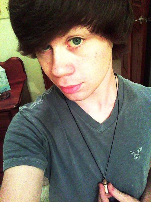
My model for my magazine was my 18 year old friend, Richard. He has the stereotypical appearance of a rock artist due to how his hair sits after styling it, appearing as if it has not been styled at all due to it's natural waviness. When taking my photos, I wanted to have his hair straighter because I wanted a more sophisticated look that challenged the stereotypes that rock magazines create.
Due to my model, I would come to a final conclusion that my target audience is in fact younger than 28 and more so between 16-21 mainly because of the way I have put forward some of the things I have said within my pages. My pages go for a very casual approach that is meant to be read lightly and as if an actual conversation is being had with an actual person. Because of this conclusion, it means I can make further analysis into my target audience by looking into my model himself, where he shops and what music he listens to.
If you were to look at the music that Richard is most fond of, it would revolve around Rock and Metal, as well as some occasional Pop Punk. Some artists found within his music libraries would include Paramore, My Chemical Romance and Slipknot, three very different bands that cover all three genres mentioned. Richard is a fan of physical CDs, and has created a rather large collection of them within his bookshelf; his preference of physical CDs in comparison to digital MP3s comes down to his music choice, with the majority of his favourite bands having become popular before MP3s were as big as they are today. In order to buy his CDs, Richard would visit HMV as this would contain all the music he would want to find, as well as many other genres that might take his fancy.
In terms of clothes, Richard is always wearing Jeans, varying from simple Black jeans to bright vibrant Red jeans. The concept of wearing odd coloured jeans matches with my previous statements on how fans of Rock don't want to conform to the rules of society and want to stand out amongst the masses because of their individuality; for this reason also, Richard is found to be shopping online more so than he is found to be shopping outside due to the larger range of clothes that can be found on his favourite sites.
By shopping for his clothes online, it means he can get whatever he wants whenever he wants without having to worry that the store has run out of stock. Online retailers also contain a lot of exclusive clothes that he would not be able to find anywhere else; you could say that with some of the places he shops, he has slight aspects of being a hipster, although this is entirely down to personal view. Some commonly visited sites include: https://www.joythestore.com/ and http://www.asos.com/
If I had to specify an age group, I would say that my magazine mainly focuses on those aged between 16-28, mainly because of the use of social networking throughout my magazine and how much it is intertwined with the interaction. A lot of my magazine focuses around socialising with the fan base through the use of social networking, something that some of the more older fans are not as familiar with, or do not see the point of. I would say that my magazine is aimed at both male and female for different reasons; the male aspect because of the music and the style, although possible towards females too because of the social networking interaction (It is a lot more common for a female to gain an 'obsession' with a magazine and start to socialise with the creators and add in their own input, which is easily done with the link my final piece has with this).
My model for my magazine was my 18 year old friend, Richard. He has the stereotypical appearance of a rock artist due to how his hair sits after styling it, appearing as if it has not been styled at all due to it's natural waviness. When taking my photos, I wanted to have his hair straighter because I wanted a more sophisticated look that challenged the stereotypes that rock magazines create.
Due to my model, I would come to a final conclusion that my target audience is in fact younger than 28 and more so between 16-21 mainly because of the way I have put forward some of the things I have said within my pages. My pages go for a very casual approach that is meant to be read lightly and as if an actual conversation is being had with an actual person. Because of this conclusion, it means I can make further analysis into my target audience by looking into my model himself, where he shops and what music he listens to.
If you were to look at the music that Richard is most fond of, it would revolve around Rock and Metal, as well as some occasional Pop Punk. Some artists found within his music libraries would include Paramore, My Chemical Romance and Slipknot, three very different bands that cover all three genres mentioned. Richard is a fan of physical CDs, and has created a rather large collection of them within his bookshelf; his preference of physical CDs in comparison to digital MP3s comes down to his music choice, with the majority of his favourite bands having become popular before MP3s were as big as they are today. In order to buy his CDs, Richard would visit HMV as this would contain all the music he would want to find, as well as many other genres that might take his fancy.
In terms of clothes, Richard is always wearing Jeans, varying from simple Black jeans to bright vibrant Red jeans. The concept of wearing odd coloured jeans matches with my previous statements on how fans of Rock don't want to conform to the rules of society and want to stand out amongst the masses because of their individuality; for this reason also, Richard is found to be shopping online more so than he is found to be shopping outside due to the larger range of clothes that can be found on his favourite sites.
By shopping for his clothes online, it means he can get whatever he wants whenever he wants without having to worry that the store has run out of stock. Online retailers also contain a lot of exclusive clothes that he would not be able to find anywhere else; you could say that with some of the places he shops, he has slight aspects of being a hipster, although this is entirely down to personal view. Some commonly visited sites include: https://www.joythestore.com/ and http://www.asos.com/
Evaluation Question 3 - What kind of media institution might distribute your media product and why?
A media
institution focuses on the publishing of a magazine. They don’t really make the
magazine as such they just help sell it which is what a company wants because
without publishing a magazine does not make profit, and without profit the
magazine cannot be published, created a rather nice cycle.
For my magazine I
had to decide a institution that I thought would be the most suitable for my
genre. My first idea was to look into the institution that published Kerrang
and Mojo, two of my inspirations for my final work. This research leaded to
Bauer, a Uk institution responsible for many of the leading music magazines.
One thing that
really led me towards this institution is the close link that it has with
social networking. A lot of my magazine talks about social networking and how
the editor reaches out to the community through these mediums in order to
partake in-group discussion amongst the fans. This concept is not necessarily
new, but it Is a very effective method amongst music magazines for attracting a
strong fan base, which is why I included within my design.
I exampled the link with social networking on my contents
page; at the base of the page I made sure to give reference to different
websites. I included Twitter, Facebook and Tumblr, three very popular websites
amongst teenagers, and especially popular for Magazine creators as they give a
very simple method of distributing information. There are many references
within my contents that link to the community and twitter; an entire section of
the contents revolves around talking to the community.
Bauer allow for subscriptions to be made online to each of
the magazines that they produce, which would be a very useful feature to have,
along with the ability to subscribe through a phone number. The price of
magazines within this institution basically remain the same, which is why I
would want to follow through with them, in order to create a magazine that fans
of other magazine styles would not think feels out of place.
The money to begin the magazine process would need to be
built over time by those who would wish to pitch the concept to the
institution. For example, if I and a group of friends were serious about making
this a real magazine, I would need to create an initial pool that would help build my magazine from the ground up, eventually making a profit that I can use to fund the magazine and hopefully keep part as a profit.
Evaluation Question 2 - How does your media product represent particular social groups?

My Magazine is mainly focused around Rock and Pop Punk, and I felt that Richard (My Model) represented this well. I found another artist of a similar genre and compared both them and my model to see the similarities and it can obviously be seen the aspects they share. Both have a similar haircut, except my model's hair is in fact straightened, although natural wavier. The long unstyled haircut is very popular amongst my genre as the form usually wants to go against what society wants; this can also be seen by looking at the clothes that my genre wears. The social group that relates to this is the young teenagers around 17 years old; the reason for this is because this is the generally the fan base that this music style produces amongst the masses. My Target Audience mostly relies around Males due to the nature of the music, although this genre can attract some Female audience.
My model is wearing smart clothes, which someone challenges the style of rock due to the reasons stated before; I decided the clothing my model would wear would be this because I felt it let him stand out amongst the other magazine models of whom are generally wearing their own casual clothing. Both my model and the artist I found are playing an instrument, although one is a bass and one is a guitar. The age of the two examples is not really the same, although we can say that they are definitely of the same ethnicity and possibly have the same height, hopefully making them quite similar. Both of the pictures have very similar expressions, connoting that they display the same mood while performing live.
Thursday 10 April 2014
Evaluation Question 1 - In what ways does your media product use, develop or challenge forms and conventions of real media products?
Before starting the creation of my magazine, I had to research into the existing formats of magazine designs to take away some ideas and concepts to create my own idea. The Genre that I decided I wanted to follow was Rock/ Pop Punk, so my main focus revolved around Mojo and Kerrang, with a rather cluttered style to represent the style of music present.

When designing my final magazine, I waned to take some of the best ideas from the magazines I researched into, and add some of my own ideas to create a new product. My front cover conveyed the red header, whilst varying with the black footer; I thought that giving this contrast of Red above and Black below would allow for a much more graphically pleasing look, and am happy with the final result. Some variations of the Kerrang front cover use rotated objects to add into the cover image giving it a 'messy' type of style which is something that I used for my front cover; text is very common for this style, as used for my cover for the header and the sub header. My contents is rather similar to that of Kerrang with positioning, I followed the concept of using a black box header with yellow text on the inside, one of the strongest contrasts of colours to help keep a very bold and easily seen style of header. My Front Cover follows the 'F' Pattern.
A style that I decided to input was to add subtitles into the titles underneath each header; I used this to give more details into some of the page titles and make the page seem more filled than it would without them. For the subtitles I used a dark grey in order to make sure that the reader knows what they are meant to focus on first and what they are supposed to focus on next. When it came to the 'Album Reviews' and 'Interviews' I used a simple list in a font 4px bigger than the rest of the font, without any subtitles so that it stuck out amongst the rest of the page. There were other sections of the contents that I mixed together elements of Subtitled titles and Non-Subtitled titles to give a sense of contrast.
I wanted my contents to appear as if there was a lot going on, which there was. My contents is just about filled with information and references to what is within the magazine, with little space. I tried to keep a rather thick gap on the left of my page in comparison to the right, because of how the page would appear in a real magazine. This contents has been made to appear as if it is going to be on the right page as apposed to the left, with the space acting as a way to help not cut out any information with the page folds. The space also allowed for more contrast as it made the page generally look a lot more professional.
My double page spread was a hybrid of an interview and a story on the artist I chose. I rendered out the person in the picture I used for my page and changed the background to be a gradient of a Light Grey, and a slightly Darker Grey; the way this was done is very apparent, and easy to notice with the white text being placed upon a darker background and the black text placed onto a light background. I used a mix of white text and red text for the header because I felt this worked as a nice contrast, and kept the body of the text black, as this is a very common style used within Kerrang and Mojo. I tried to keep the background light while keeping the body of the text darker to create a nice contrast; my original idea was to have a black background with red and white text but I found this to be too difficult as I could not render out my models hair to suit the black background (Mainly due to my method of rendering, which including layer masks that I couldn't seem to make comply with the colour black). I kept with the colour Red in my double page spread for my subtitle because when I tried experimenting with the different colours, this matched a lot better than some other variations, that included different shades of black amongst other colours such as yellow.
The image I used on my Double Page Spread was of my model looking a lot more casual than he did during the photos that were contained amongst the rest of the pages. I felt that this connoted a much more laid back atmosphere and allowed the reader to look at the page and feel as if he was the kind of guy that would be respectable to talk to, which is what I wanted to achieve. He is still sporting his suit, although this time he is not wearing the outer coat causing his arms to appear white from the lack of black covered; this shows well in the final piece as it allowed me to display skills of rendering with similar colours as the background is a similar shade to the parts I had to render. White is a much harder colour to render out of an image, as the intensity of the colour can vary extensively, so I had to take a lot of care when cutting out the background of this image, as well as any of the other images that had him with the same style.
The style that is exceptionally popular when it comes to this genre, more so in Kerrang is to have a rather large logo at the top, with a rendered image of a music artist that is made to cover some, and sometimes all, of the magazine name. It is very common for the layers to overlap, with other layers being on top of the magazine title other than the rendered image, to give a sense of depth. There is often a headline, which more often than not is the name of the artist, with a subtitle following afterwards that usually related to the story in which the artist is in.
Kerrang is particularly fond of red headers and footers, as seen in the example magazine I have shown; white text on red is very clear and easy to see in terms of contrast, so Kerrang like to use this style in order to make certain that the user can see what is included within the issue. The background is kept rather simple so that attention is not drawn away from the main image on the page; this technique is one that a lot of other magazines tend to take after too
I wanted my contents to appear as if there was a lot going on, which there was. My contents is just about filled with information and references to what is within the magazine, with little space. I tried to keep a rather thick gap on the left of my page in comparison to the right, because of how the page would appear in a real magazine. This contents has been made to appear as if it is going to be on the right page as apposed to the left, with the space acting as a way to help not cut out any information with the page folds. The space also allowed for more contrast as it made the page generally look a lot more professional.
Sunday 23 March 2014
Evaluation Question 7 (Draft) - Looking back at your preliminary task (the continuity editing task), what do you feel you have learnt in the progression from it to the full product?
My Prelim task focused on a school magazine; I used a stock photo background and a dark image that was not taken in the best of conditions. I used an outer glow on the image to make the model seem as if he was actually in the background and not just added on. I already had some knowledge of the programs I was going to use, although I did gain some knowledge throughout the production.
I believe that my biggest downfall was my positioning; I struggled deciding where I would position each of the components of my design work, although this did improve throughout the production of my magazine. My confidence has improved a lot when it comes to my design work, with the ability to pick colour schemes, to the ability to pick fonts. A big problem I had when making my magazine was deciding what fonts to use, I used references to other magazines and picked fonts that used the same spacing, although had a different style allowing me to have a reference and make progress.
My Target Audience changed a lot through the development of my work; for my prelim my Audience revolved around school teenagers aged 15-19 of both genders, whilst my current age group revolves around males aged 16-24. The changes to my Target Audience caused my language to change when addressing my audience as well as the images I used and lighting alterations.
Trying to find an appropriate target audience was rather easy as the magazines that my magazine was based around already have the same audience.
Evaluation Question 6 (Draft) - What have you learnt about the technologies from the process of constructing this product?
Relying on natural and synthetic light while taking photos is not one of my strong points, as I am not perfect with the format of taking pictures in a studio. I have never had a strong sense of being able to tell what lens or settings to use while taking a photograph outside, and within a studio the same problems apply; I tried to overlook these by creating the best lighting situation I could, giving me a lot of space to work on editing the photo in Photoshop.
For my double page spread, I did have a temptation to use a different program other than Photoshop, but decided in the end to stick with what I knew and create something that could easily be created in the program that I knew well.
Evaluation Question 5 - How did you attract/address your audience?
In order to attract my audience, I tried to address them in a very casual tone. The reason for this format of addressing the audience is to make the audience feel as if they are having a conversation with a real person. By making the Audience think they are talking to a real person, it allows them to feel a lot more casual while reading and in a real life magazine it would cause them to want to try and socialise with the content, such as going on Twitter and Facebook and making contact with the creators, creating a community.
I included a lot of images of Richard, my model that featured on all pages that I created. My model is dressed in very smart clothes, a suit, this is to help attract my audience, male; they see a smartly dressed male and desire to look like him. It could be said that my audience could stretch to female because of the male on my cover, and how he is dressed, although this would be down to personal preference.
I took 200 photos over the course of two photo-shoots; the first photo-shoot I took did not land me with any good shots that I wanted to keep, as they were of a different model, so in the end I decided to delete them. My second session was of my current model and contained a lot more professional looking photographs that I was able to use for my final magazine. The first photo-shoot I had only used two lights, but the third used three, and with the use of three lights it allowed me to take a lot brighter and vivid photos.
On my double page spread, I added filter effects to my image to make the colours more vivid, especially the strap on the guitar; there are two lines of blue on the strap that I added filter effects to make stand out amongst the rest of the image, giving a very vivid contrast of colours.
Evaluation Question 4 (Draft) - Who would be the audience for your media product?
 Without a doubt, my Target Audience is male between age 16-24. I can say this very confidently because of the style of music and how it is applied to it's audience. If I take an example of one of my friends Richard, who bears the stereotypical look of a 'Rock Fan' as seen on the image to the right, and take a look at his Ipod you will find the style of music that is found wthin my magazine.
My artist, who coincidentally is Richard, is a 'Made-up' rock artist who strives to apply to many different age groups, one of them being the group my magazine applies to. My Target Market spend their free time researching into their favourite artists; following them on Twitter, Facebook and Tumblr to provide them with enough knowledge to satisfy their hunger for the addiction that is their taste in music. Music Artists of this Genre are very common users of these mediums of communication, using Social Networking to communicate with their fans.
My Audience rely on television containing controversial humour because of their desire to rebel against society; the same applies to the style of music that is popular for this Audience, with the desire to go against what is seen as what the age group should be/ act as.
Evaluation Question 3 (Draft) - What kind of media institution might distribute your media product and why?
I exampled the link with social networking on my contents page; at the base of the page I made sure to give reference to different websites. I included Twitter, Facebook and Tumblr, three very popular websites amongst teenagers, and especially popular for Magazine creators as they give a very simple method of distributing information. There are many references within my contents that link to the community and twitter; an entire section of the contents revolves around talking to the community.
Bauer allow for subscriptions to be made online to each of the magazines that they produce, which would be a very useful feature to have, along with the ability to subscribe through a phone number. The price of magazines within this institution basically remain the same, which is why I would want to follow through with them, in order to create a magazine that fans of other magazine styles would not think feels out of place.
Evaluation Question 2 (Draft) - How does your media product represent particular social groups?
Through the research of my magazine, I found that the target age group of my style of magazine revolves around 16+ male, and potentially female. On UK Tribes my Audience remain in the groups 'Skaters' and 'Young Alts' because of their desire to break away from what the word sees as 'Normal' for their age group. It is not very common for Skaters to be into mainstream music, and as such this fits my style almost perfectly, as it is not very often that Rock/ Pop Punk is classified as Mainstream amongst others.
Evaluation Question 1 (Draft) - In what ways does your media product use, develop or challenge forms and conventions of real media products?
Before starting the creation of my magazine, I had to
research into the existing formats of magazine designs to take away some ideas
and concepts to create my own idea. The Genre that I decided I wanted to follow
was Rock/ Pop Punk, so my main focus revolved around Mojo and Kerrang, with a
rather cluttered style to represent the style of music present.
When designing my final magazine, I waned to take some of the best ideas from the magazines I researched into, and add some of my own ideas to create a new product. My front cover conveyed the red header, whilst varying with the black footer; I thought that giving this contrast of Red above and Black below would allow for a much more graphically pleasing look, and am happy with the final result. Some variations of the Kerrang front cover use rotated objects to add into the cover image giving it a 'messy' type of style which is something that I used for my front cover; text is very common for this style, as used for my cover for the header and the sub header. My contents is rather similar to that of Kerrang with positioning, I followed the concept of using a black box header with yellow text on the inside, one of the strongest contrasts of colours to help keep a very bold and easily seen style of header. My Front Cover follows the 'F' Pattern.
A style that I decided to input was to add subtitles into the titles underneath each header; I used this to give more details into some of the page titles and make the page seem more filled than it would without them. For the subtitles I used a dark grey in order to make sure that the reader knows what they are meant to focus on first and what they are supposed to focus on next. When it came to the 'Album Reviews' and 'Interviews' I used a simple list in a font 4px bigger than the rest of the font, without any subtitles so that it stuck out amongst the rest of the page. There were other sections of the contents that I mixed together elements of Subtitled titles and Non-Subtitled titles to give a sense of contrast.
My double page spread was a hybrid of an interview and a story on the artist I chose. I rendered out the person in the picture I used for my page and changed the background to be a gradient of a Light Grey, and a slightly Darker Grey; the way this was done is very apparent, and easy to notice with the white text being placed upon a darker background and the black text placed onto a light background. I used a mix of white text and red text for the header because I felt this worked as a nice contrast, and kept the body of the text black, as this is a very common style used within Kerrang and Mojo.
The style that is exceptionally popular when it comes to
this genre, more so in Kerrang is to have a rather large logo at the top, with
a rendered image of a music artist that is made to cover some, and sometimes
all, of the magazine name. It is very common for the layers to overlap, with
other layers being on top of the magazine title other than the rendered image,
to give a sense of depth. There is often a headline, which more often than not
is the name of the artist, with a subtitle following afterwards that usually
related to the story in which the artist is in.
Kerrang is particularly fond of red headers and footers, as
seen in the example magazine I have shown; white text on red is very clear and
easy to see in terms of contrast, so Kerrang like to use this style in order to
make certain that the user can see what is included within the issue. The
background is kept rather simple so that attention is not drawn away from the
main image on the page; this technique is one that a lot of other magazines
tend to take after too
Wednesday 19 March 2014

Tuesday 18 March 2014


Friday 14 February 2014


Tuesday 4 February 2014
Magazine Prelim Evaluation
How does your Prelim represent particular social groups?
Generally the content of the magazine would be aimed at a particular school, due to how grading systems might vary around the country, or specific curriculum being slightly altered. Most of the time, a school magazine would not be made to reference a particular age group, and instead to focus on a school; I made reference to 'Antony' in my Prelim, which would be entirely meaningless if you did not know who Antony was in the first place.
Who would be the Intended audience for your product?
 As my Prelim Magazine is a school magazine, it means that it would be aimed at the age group that are still at school; primary 16-18, as this is around the age that School Exams become a lot more frequent, and coursework becomes more regulatory. Post-16 could be the Age group you could put my Prelim's Target Audience in more specifically as Exams around this time become a lot more stressful in comparison to that of the previous years, and in most cases, students have left their current school to go to a new College and need some support getting through the first year of the new term.
A lot of the content referenced in my Prelim magazine revolves around exams and Ucas; for this reason I would say for definitely that my target audience revolves around students that are of this age group, for if a person of a younger age were to read the content within the pages, it would not make as much sense because they are not subjected to this set of information.
How did you attract/ address your audience?
In my Prelim, I tried to go for a very casual approach as if it was a Student that was talking to the Audience (Which in retrospect it actually is). The reason I decided to go for this form of language approach is because when a Student needs help with something, whether it be Exams, Revision or anything else, it would be more likely that they would want another Student to give help using the linguistic that they are most fond of.
As I am currently in the current year as my Target Age Group, it means I am able to use the correct language with little to no effort as it is literally how I speak regardless; this means that while writing the different components of my Prelim, I can easily succeed at trying to grab the attention of the correct Audience and hopefully, if this was a real magazine, purchase a copy of the Magazine itself.
What have you learnt about technologies from the process of constructing this products?
In order to produce my Prelim I needed to have some basic Knowledge of Photoshop; I already had such knowledge from previous work I had to perform throughout my other subjects, and as such it meant I was able to produce my Prelim very easily. The main Aim for the final magazine is to try and produce a Professional looking final product that would look as if it would be found in a shop amongst the shelf of every other already successful magazines.
I had to create a logo that looked Semi-Professional; so I tried to experiment with a sort of 'Techno' font that gave an effect of distortion, whilst using a different font to keep the first half of the logo plain, so that I did not overuse the same font continuously. If I was to redo my Prelim, I would definitely not use the font that I used because I think that I did overuse it a little throughout my magazine.
Generally the content of the magazine would be aimed at a particular school, due to how grading systems might vary around the country, or specific curriculum being slightly altered. Most of the time, a school magazine would not be made to reference a particular age group, and instead to focus on a school; I made reference to 'Antony' in my Prelim, which would be entirely meaningless if you did not know who Antony was in the first place.
Who would be the Intended audience for your product?

A lot of the content referenced in my Prelim magazine revolves around exams and Ucas; for this reason I would say for definitely that my target audience revolves around students that are of this age group, for if a person of a younger age were to read the content within the pages, it would not make as much sense because they are not subjected to this set of information.
How did you attract/ address your audience?
In my Prelim, I tried to go for a very casual approach as if it was a Student that was talking to the Audience (Which in retrospect it actually is). The reason I decided to go for this form of language approach is because when a Student needs help with something, whether it be Exams, Revision or anything else, it would be more likely that they would want another Student to give help using the linguistic that they are most fond of.
As I am currently in the current year as my Target Age Group, it means I am able to use the correct language with little to no effort as it is literally how I speak regardless; this means that while writing the different components of my Prelim, I can easily succeed at trying to grab the attention of the correct Audience and hopefully, if this was a real magazine, purchase a copy of the Magazine itself.
What have you learnt about technologies from the process of constructing this products?
In order to produce my Prelim I needed to have some basic Knowledge of Photoshop; I already had such knowledge from previous work I had to perform throughout my other subjects, and as such it meant I was able to produce my Prelim very easily. The main Aim for the final magazine is to try and produce a Professional looking final product that would look as if it would be found in a shop amongst the shelf of every other already successful magazines.
I had to create a logo that looked Semi-Professional; so I tried to experiment with a sort of 'Techno' font that gave an effect of distortion, whilst using a different font to keep the first half of the logo plain, so that I did not overuse the same font continuously. If I was to redo my Prelim, I would definitely not use the font that I used because I think that I did overuse it a little throughout my magazine.
Monday 3 February 2014
Antony Photo Session


Zilberts' photostream on Flickr.
I had a session taking photographs of Antony as a potential model for my final product; we tried to get a large variation of shots in hopes that it would give me more to work with in terms of the style of my magazine's front cover. I particularly like the close up shots that I took, although some of the longer body shots could be potentially useful if I was to render the background correctly.
We will most likely have another session to try and take these photos again, experimenting with a lot more props and clothing than we did in this session. The problem we had with this session is that it was a spur of the moment thing, and as such we did not have any extra props or material that we could use to improve our pictures; given another opportunity, we would make sure that we plan out what to bring in hopes that we can take an even better set of pictures. This also acting as a type of test, because I was not very experienced with the lighting; the lighting changes amongst the different pictures because of how I was constantly moving the two lights into different positions, causing different amounts of shadow. The close up pictures show this very clearly, as there is a lot of shadow behind. In another photo session, I would carefully position the lights depending on the shot I was going to perform.
Friday 31 January 2014

Saturday 18 January 2014
Research Into Graphic Designers
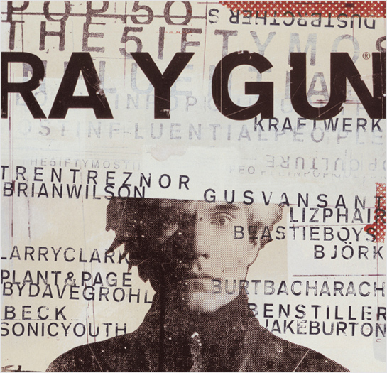 David Carson is an American graphic designer best known for his design for the magazine 'Ray Gun'. David enjoyed Grunge typography a lot and included this in almost all of the work he produced. His style was very unique because it appeared as an almost unreadable mess that just looked right; he very commonly produces images that have parts replaced with grunge typography adding to his creative talents.
Carson left Ray Gun to make his own studio, and in the following years he did work for many companies including, but not limited to, Ray ban, Nike and Pepsi Cola. Not only does Carson produce these designs, he regularly holds lectures and workshops in America and Europe to help inspire those who want to become graphic designers just like him.
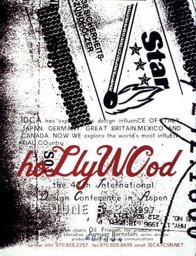
Below are some more examples of his work; showing off some of his creative talents, and giving a better explanation into his grunge text format:

Style of Magazine

For a contents, my style would revolve around something similar to that of Mojo. Mojo focuses it's contents on a single image with a small box containing
Audience Profile
From the research I've made, I've decided that my target market would be primarily male aged from 16-30, as I think that this is a suitable and achievable target audience. The stereotypes of Rock and Pop-Punk come into play here. I have composed an Audience Profile of an example of what I would assume to be my Audience.
 Name: Tyler Black
Age: 17
Music Genres: Typer prefers to listen to Punk-Rock and Rock music on a regular basis.
Biography: Undergoing his first year of A-Levels, Tyler likes to spend time relaxing browsing Tumblr and listening to his favourite bands 'Paramore and My Chemical Romance'. Although his personal preference does not always focus around Rock music, he would still say that this would be his preferred genre.
Analysing of Institutions
Upon looking into different institutions that would potentially publish a magazine I create, one name that constantly came up in many different articles was 'Bauer' renown for the publication of Q, Mojo and Kerrang. Bauer operates in 15 countries worldwide and was founded in 1875. The following is extracted from the Bauer website, and speaks more about what they are as a company.
From reading this it is very apparent that this institution would be a perfect match for my magazine, as my genre is very similar to that of what is already being produced by them.
Bauer Media is a division of the Bauer Media Group, Europe’s largest privately owned publishing Group. The Group is a worldwide media empire offering over 300 magazines in 15 countries, as well as online, TV and radio stations.
Bauer Media joined the Bauer Media Group in January 2008 following acquisition of Emap plc’s consumer and specialist magazines, radio, TV, online and digital businesses. Collectively, the Group employs some 6,400 people.
Bauer Media is a multi-platform UK-based media Group consisting of many companies collected around two main divisions – Magazines and Radio - widely recognised and rewarded as being industry innovators.
Our business is built on influential media brands with millions of personal relationships with engaged readers and listeners. Our strategy is to connect audiences with excellent content through our broad multi-touch point brand platforms, wherever and whenever and however they want. Our wide portfolio of influential brands gives us advantages over pure play magazine or radio competitors.
Our magazine heritage stretches back to 1953 with the launch of Angling Times and the acquisition in 1956 of Motor Cycle News, both still iconic brands within our portfolio.
The seeds of the company’s radio business were planted in 1990 with the acquisition of London dance station Kiss FM (now called Kiss 100), followed by the acquisition of Liverpool's Radio City and later by TWC and the Metro Group. Then came the acquisition of Melody FM which was transformed into the market-leading Magic 105.4.
In 1994, the company bought a small magazine called For Him Magazine which is now the core of the best-selling international multi-platform brand FHM.
In 1996, we acquired digital music TV channel The Box, as a route into the small screen business, which has grown into Box Television, a seven channel joint venture TV business with Channel 4.
Continuing its history of magazine launches, Closer was launched in 2002 and Britain’s first weekly glossy, GRAZIA, was launched in 2005.
Today, Bauer Media spans over 80 influential brand names covering a diverse range of interests including heat – the must have weekly celebrity title, Parkers, MATCH!, CAR and Yours.
From reading this it is very apparent that this institution would be a perfect match for my magazine, as my genre is very similar to that of what is already being produced by them.
Audience Research
Though Hardcore is a new addition to UK Tribes (it’s only recently regained sufficient momentum to genuinely warrant inclusion), this Tribe has its roots in the punk rock scene, originating in LA in the late 1970s. California’s Black Flag are often referred to as the godfathers of Hardcore.
The ethos of the Tribe resolves around two core values – self-expression and individuality. Hardcore Kids are passionate about the Hardcore sound, a screaming genre of punk with severe tempo changes, double bass in the drums, and dirty chords from the guitarists (heavily distorted, tapping into any feedback and harmonic noises available!) Tribe members will actively support independent record shops and local, homegrown bands.
Image is key to the Tribe, and the look is not so dissimilar to the Hipsters – think turned up skinny jeans, tight fitting band tees, plaid shirts and Vans. Tribe members will often have tattoos, showing their creative side through full-scale sleeves or individual flash pieces. As Skin Deep columnist Paul Sweeney says, “Nothing shows commitment to self expression like custom tattoos and body modification.”
- From uktribes.com
I looked at the different Tribes to try and find a group that would become my Target Audience. Instantly I found 'Hardcore' that have the roots of Punk Rock, and show self expression through custom tattoos and body modification, not unlike the research into Style of the Genre.
I am going to be asking my peers some questions in order to formulate a structure to help decide the format of my magazine, and make sure that what I produce is in fact what the consumer wants (The consumer being people of the 'Hardcore Tribe')
1.) What Artist has inspired you the most?
2.) Do you fit the stereotype of Rock Fashion?
3.) Where do you go to buy your clothes/ stylish items?
4.) Are you a regular listening of the Radio?
5.) Would you say you can pinpoint just one genre you enjoy?
6.) Of the Genre(s) you enjoy, why is it you enjoy them?
7.) Does your lifestyle reflect your music taste?
8.) Have you experimented with alternative genres?
9.) How interested are you in the 'Behind-The-Scenes' of bands you enjoy?
10.) Are you lyrics of the songs you listen to important to you as a person?
Friday 17 January 2014
Research Into Fashion/ Styling of Genre

The majority of people who indeed like this Genre of music can't really be labelled down to a single clothing style, so we are going to be talking about the Rock/ Pop-Punk stereotype. The image on the left is a good example of what we would pin point as a 'rock loving' individual; he is wearing chains and has a dark/ grunge shirt containing a skull.
The man has tattoos on his right arm, which is a very common stereotype with the Rock genre; we associate the rebellious attitude that youngsters have with rebellious music such as Rock itself; by seeing a person that has chains and tattoos we automatically assume that they are into that type of music, without questioning it any further.
Modern music is more technological than that of previous music such as Rock; for this reason the popularity is becoming rarer to identify. The Style of Rock Music is very instrumental, in a way that every instrument is physically recorded as well as the vocals, as apposed to electronic music where as most instruments are synthesised.
Depictions of Rock vary amongst different media platforms; a magazine that revolves around the genre would probably judge the music style a lot differently than a magazine that reviews all types of music. We usually reference Rock artists as very hardcore and over excessive, a great example of this would be KISS, who obviously are entirely different to many other related bands; a point to make is that bands like KISS are still playing music even after the evolution of music we have currently.
Deciding Magazine Title
Using my Magazine Name research I have been able to think about what makes a successful name;
Language Register
The style of writing when it comes to Rock/ Pop-Punk Magazines is very casual, as the article writers want to try and connect to the audience on a personal level. Since I want my Magazine to come across as very friendly and socially sound, I will try to make sure that my style of writing is very personal and inclusive.
Magazine Name Research
Magazines are given names that represents what they are about, or what they include; I did some research into the different names that some Magazines have and why they are given such name.


 Following the success of Q, the magazine 'Mojo' was created to help bring more attention to Classic Rock Music. Every article of Mojo includes an exclusive CD.
Kerrang is a Rock Music magazine produced in the UK. The name Kerrang comes across as odd because it does not mean anything; the origin of the name comes from the sound that is made by playing a Power Chord presented through an onomatopoeia.
Q is a Pop Music magazine produced in the UK. Q has an interesting name because of how short and unexplained it appears; Q's original name was 'Cue', as in to cue on the next act at a concert, but over time they changed the name to simply the letter Q.
Subscribe to:
Posts (Atom)